The power of design is undeniable. It can create an emotional connection, cultivate a community, or convey information in just one glance.
While there are many elements of design that create incredible (or sub-par…) designs, one element has a distinct importance: Fonts.
From the color to the style to the spacing, the right typography can make or break a design. And when your design is a book cover, which relies on words to retain readers, the importance of your book cover font grows tenfold.
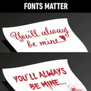
In this article, you will learn:
- How certain fonts impact consumer emotions
- Why certain fonts have cultural associations
- How the layout of typography will influence a consumer’s connection
- How book cover typography can enhance the book itself
Table of contents
- How Book Cover Typography Influences Emotion
- Certain Fonts Are Associated With Certain Things
- Why Font Layout Matters
- Judging Books By Their Covers
- Best Genre-Specific Book Cover Typography
- Where to Find Awesome Book Cover Fonts
- How To Pick The Perfect Book Cover Font
- More Resources For Designing A Winning Book Cover
- About The Author: Stephanie Sharlow
Luckily, understanding how fonts can work in your favor is easier than you think. We explored the impact typography has on human emotion, cognitive recognition, and ultimate action – plus, some book cover designs that excelled in the font department and why.
How Book Cover Typography Influences Emotion
There are three different prongs of typography that can trigger emotional and cognitive responses:
- Serif or sans serif
- Modern or script
- Monospaced
All of these elements work together to help the designer create the response that they desire from the audience.
Generally speaking, serif fonts (those with the little embellishments at the ends of letters) are seen as comforting and traditional, while sans serif is more minimal and objective. Scripts are more elegant and creative, while modern fonts are strong or chic. Monospaced fonts are, as the name suggests, quite boring – like the font of a vintage typewriter, there’s not much personality behind them.
Choosing the right font – whether you create a custom one or pick from one of the many out there already – can have direct implications for any design. You want your consumers to associate specific connections with your brand or book, and your font CAN make that happen.
To start, try defining your ideal final font with an adjective that represents the work as a whole, such as playful or mysterious.
What's that ONE adjective your book cover represents? Here's why your book cover font is critical #BookMarketing #PubTipClick To TweetCertain Fonts Are Associated With Certain Things
The more specific types of fonts are used within an industry, the more people will associate those fonts with related actions or emotions. The Next Web breaks this concept down quite well. They looked at Bank of America’s website, which is written in a simple font associated with the journalism industry and therefore, appears very trustworthy – after all, most people associate credible news sources with trustworthiness.

But when they tampered with the font, changing it to a bold and compact font instead, that dependability disappears. Its overabundance suddenly seems cluttered, perhaps frantic, and unorganized.

This idea showcases how your book cover font should relate to both the genre and the topics discussed on the pages. You don’t want to write a poignant romance, then use the mysterious retro font from Stranger Things (unless you’re going for something ironic, a la the Stranger Love Songs print designs). And you'll probably pick a different font if your book is for millennials versus Baby Boomers.
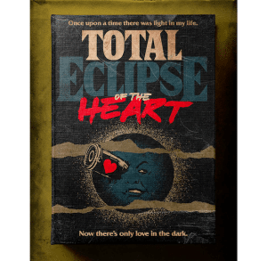
Why Font Layout Matters
It may seem obvious, but the type of font you use isn’t the only important piece of the pie – the way it’s laid out and how the sentence is structured has just as much weight in capturing an audience. In fact, a study from an MIT psychologist found a direct link between a poor layout and negative emotions in readers.
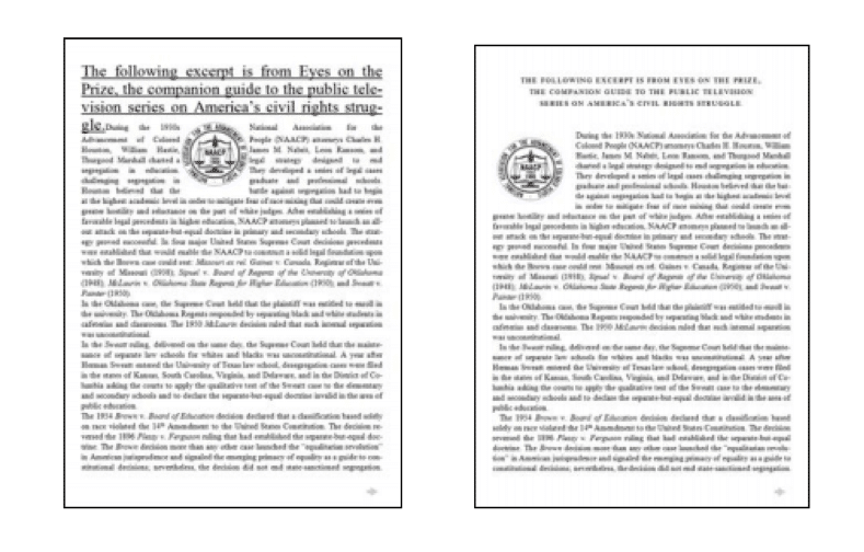
The study showed readers two different layouts: bad (left) and conventionally good (right). Not only did reading the left example cause negative thoughts and feelings in subjects, but it literally made them frown – an action that’s also proven to increase negativity.
While that example is clearly much more text-heavy than a book cover would (hopefully) be, its implications can be drawn into all facets of design – particularly when text is involved. A good layout makes people happy, and a bad layout makes people sad, disappointed and underwhelmed. And when you feel the former, you’re more likely to be engaged with the material you’re consuming.
Judging Books By Their Covers
There are several books that find the perfect balance between design and font style, visually displaying how a novel can create an emotional connection before even cracking open the book.
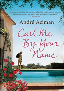
One example is critical darling Call Me By Your Name. The book cover uses a simple, scrawled yet elegant font that harkens the simpler times of a summer love from decades past – like a well-worn letter or diary entry. It’s well-spaced and prominent, yet leaves plenty of room for an intricate, vintage-looking illustration of a European summer. Meanwhile, the romantic red font sets the tone for the entire novel – a coming-of-age romance that will fill you with genuine nostalgia for your first love.
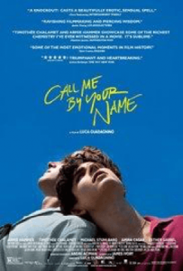
It’s important to note that this idea of raw, unfiltered emotion through book cover typography has been echoed throughout various editions of the novel, as well as the recent movie adaption, seen above. Although ultimately different fonts, each design reinforces the same idea of a loving summer under the sun in a delicate, handwritten type.
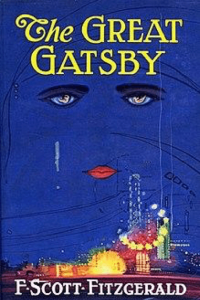
The Great Gatsby is another stellar example of well-thought-out book cover fonts. The original cover emphasizes The with an accent script font, while Great Gatsby is seen in a classic capitalized serif font – representative of the time.
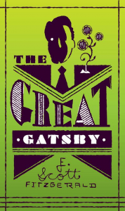
However, later editions of the novel incorporate a very exaggerated interpretation of an art deco-like font that we have come to associate with the Roaring ‘20s – even though it wasn’t necessarily used in that way at the time.
Does your font MAKE or BREAK your cover design? Find out here. #BookMarketing #PubTipClick To TweetThis geometric example shows that, as time passes, the design elements that people begin associating with times, places, people and events later in life can be so strong that incorporating them into a design, such as a book cover, will immediate communicate necessary information to readers and envelope them into your content, whatever that might be. It doesn’t have to be 150 percent historically accurate – it just has to ring a bell.
Best Genre-Specific Book Cover Typography
If you're looking for the right book cover font for your specific genre, below are some proven font choices.
Some of these fonts are free, while others must be purchased.
Book Marketing Made Simple
Over 47,000+ authors, NYT bestsellers, and publishing companies use Publisher Rocket to gain key insight to the market. Help your book now
Where to Find Awesome Book Cover Fonts
Note from Dave: Some of these fonts are available in Word, Pages, or Canva, however, most of them are special fonts that you can download and install on your computer to use.
Here are some of my favorite sites find just the right book cover typography:
If those sites don't have the font you're looking for, go to Google and search “Download Font Name” + “Font” (i.e. “Download Transformers Font“)
After you find or buy the font you want for your cover, you should download the font and install it on your computer. The exact steps to do this are different for all of us based on the type of computer being used, so if you run into a snag, do what I always do to figure something out…Google it. 😉
Now let's get started with great sci-fi fonts, shall we?
Best Book Cover Fonts for Science Fiction
Here are fonts that have a technological or scientific feel to them, thus, are safe choices for sci-fi book covers:
- Orbitron
- Akashi
- Sutton Who
- Not Just Groovy
- Cosmic War
- Star Jedi
- Deadspace
- Space Marine
- Roboto
- Transformers
- Rationale
- Matrix
- Dynatron
- Spy Agency
- Geom Graphic
- Telegrama
You can download 10 of these sci-fi approved fonts here or find even more sci-fi font ideas in this article.
Best Horror Book Cover Font
For all you authors of blood, fangs, ghosts, and creepy dolls, here are some book cover font ideas to check out:
- Violence
- Creaphy
- You Murderer
- In the Wood
- Akoom
- Devil's Hand
- Nightmare 5
- Boycott
- Demon
- Darkheart
If you need more horror book cover typography ideas, check out: 191 Free Horror Fonts, these Scary Fonts, Thrilling and Creepy Fonts, or these Free gothic and horror font ideas.
Best Book Cover Fonts for Romance
If you're a romance author, you'll want very different fonts than the sci-fi list above. Here are some foolproof choices to send the right vibe on romance book covers:
- Bentham
- Day Roman
- Twilight
- Lavenda
- Water Brush
- Butter Scotch
- Vix Antique Script
- The Dreamer
- Amaze
- LT Chickenhawk
- Sexsmith
- Wisdom Script
- Alex Brush
- Bromello
You can find lots of script fonts here.
Best Book Cover Typography for Nonfiction Books
Some trusty nonfiction cover fonts are:
- FF Nexus Sans
- BF Anorak
- Classical Garamond
- Chunk Five
- League Gothic
- Baskerville
- Goudy Book Letter
- Bebas Neue
- Gill Sans
- Futura
You can download lots of free sans serif fonts and serif fonts depending on the look you want your cover to convey.
How To Pick The Perfect Book Cover Font
At the end of the day, choosing the right font is more common sense than anything else. By following the easy tips below, you’ll find the perfect book cover typography that will captivate audiences before they even start chapter one. Who knows – maybe you’ll be on Oprah’s book club list before you know it!
- Choose a font that is associated with your genre or related content inside your book to show readers what it’s about.
- Design your cover and font in a way that is easy-to-read and understand – aesthetically pleasing is key!
- Think about the emotions you want readers to feel, then design a font around that. Tiny elements such as scripts, serifs, and line thickness all influence these connections.
More Resources For Designing A Winning Book Cover
Need more? Here are a few of the best guides you can use for creating a book cover that catches shoppers attention while they're browsing for their next book:
- The Ultimate Guide To Creating Your Book Cover Design article by Dave Chesson
- When and How to Redesign Your Book Cover podcast episode with Dave and Sasscer Hill
- Use Canva's Font Combination tool to find fonts that pair well together
About The Author: Stephanie Sharlow
Stephanie Sharlow is a Manhattan-based, Award-Winning Writer, and Digital and Lifestyle Expert. She is the Chief Editor of DesignRush.




No Fantasy! :/
The trouble with fonts is that you can easily get lost in a sea of them, and lose a few hours exploring and testing them out. I recently discovered Aviner — I love all the different variations – black, bold, book, medium, light etc. available so you can mix and match the styles for the different elements.
haha…soooo true.
I adore this posting. Superbly interesting and relevant. Well done Stephanie Sharlow! I have just republished one (21 to go) of my books as I move from CreateSpace to another place. I perceive book 1 is really a Melodrama in 3 Acts based on a ‘real’ Biblical story that seems fictional and circus like. I pondered the font on my Mac and decided on Bebas Neuv Book. I then made the font more circus like by using Photoshop styles ‘Rainbow’ and Star Glow. I used variants of this font for Tag and Author name.
That sounds brilliant! Can you post a picture here of that?
Good article, but why do not we get any fonts for mystery/thrillers? It is the second most popular genre around. I know some feel that the horror fonts cover it but I do not think so.
Haha…very true. I’ll look to get that updated if I come across something legit on that.
I am wondering about this, too!
Yes! Where are the Fantasy fonts?? One of the top genres!
How about Magical Realism? (A fascinating genre re: Book Cover creation).
Great post and some seriously useful links there. Thank you 🙂
Yeah, she did a great job!